A point of view.
A complete identity.
Black. Gold. Ivory. The identity behind two careers—made clear, consistent and ready to use.
Recognizable.
At every scale.
A full-name wordmark. A personal monogram.
One consistent point of recognition.


An atmosphere.
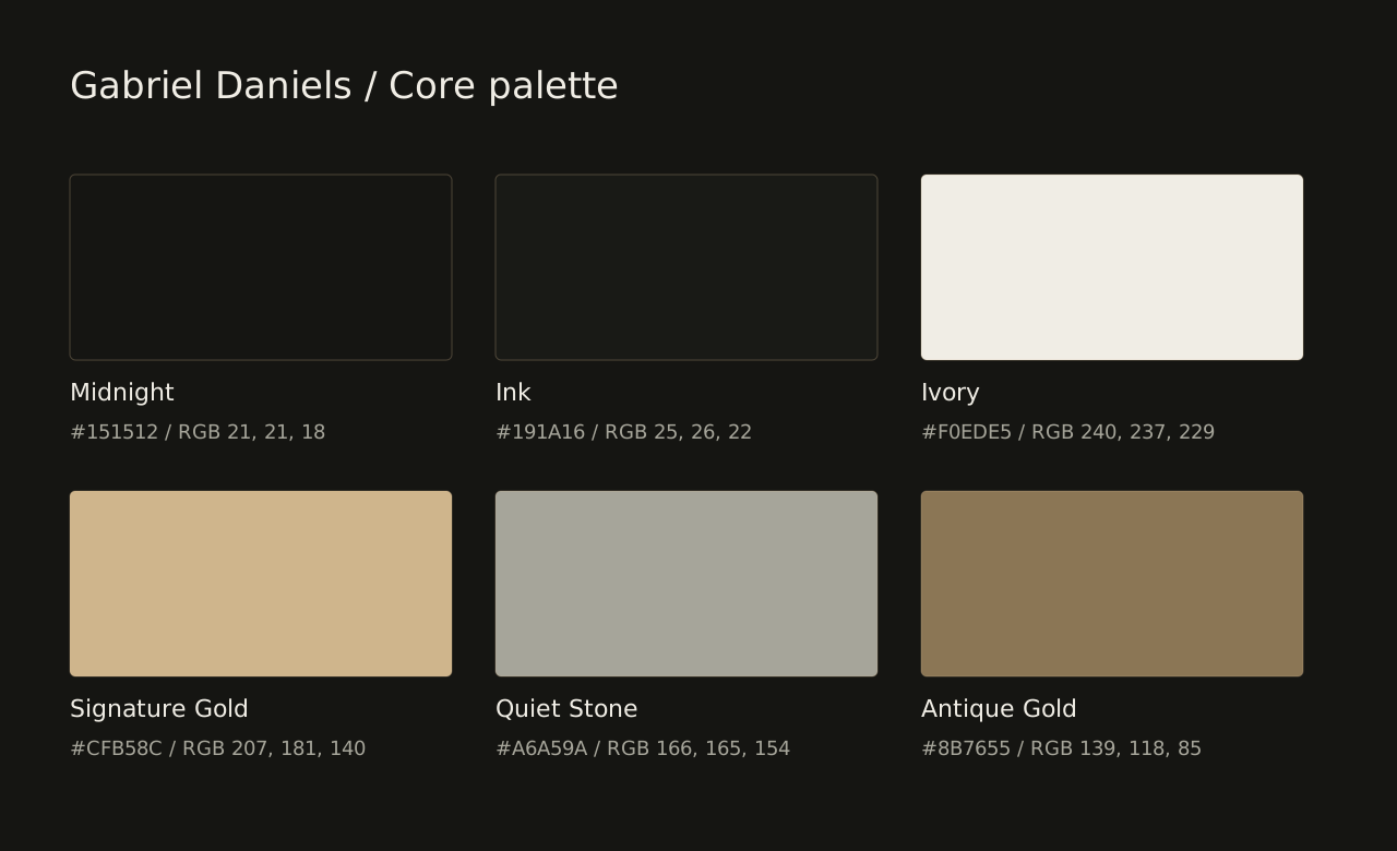
In six tones.
Discipline,
with expression.
Cormorant Garamond
The editorial voice: considered, expressive and personal. Regular and italic carry the contrast.
Native system sans
The live interface follows the visitor’s device. DM Sans is the portable companion supplied for consistent exports and templates.
Read the typography rulesA personal practice.
A connected group.
The Gabriel Daniels identity represents the person and his two careers. DOC N.I.L. is the parent company behind five specialist businesses. Client identities belong to their clients.
Logo & identity studio: logos.docnil.com ↗. A specialist destination within the group.
The files.
Ready for the work.
Get the complete package, or choose an individual asset. Every master is organized by purpose and format.
brand kit.Guide · Logos · Templates · Color · Type · Instructions Read, share or print / PDFThe detailed
brand guide.Strategy · Design language · Application · Handoff
Primary wordmark / Reversed Primary wordmark / InkPersonal monogram / Gold
Complete packages4 files +
Instructions & asset inventory28 files +
- ContentsTXT · 1 KB
- ReadmeMD · 4 KB
- Sha256sumsJSON · 11 KB
- Asset manifestJSON · 38 KB
- Square icon / Gold / PNG 1024pxPNG · 55 KB
- Square icon / Gold / PNG 192pxPNG · 6 KB
- Square icon / Gold / PNG 32pxPNG · 1 KB
- Square icon / Gold / PNG 512pxPNG · 21 KB
- Square icon / Gold / PNG 64pxPNG · 2 KB
- Square icon / Gold SVGSVG · 3 KB
- Square icon / Ivory / PNG 1024pxPNG · 56 KB
- Square icon / Ivory / PNG 192pxPNG · 6 KB
- Square icon / Ivory / PNG 32pxPNG · 1 KB
- Square icon / Ivory / PNG 512pxPNG · 22 KB
- Square icon / Ivory / PNG 64pxPNG · 2 KB
- Square icon / Ivory SVGSVG · 3 KB
- Square icon / Midnight / PNG 1024pxPNG · 55 KB
- Square icon / Midnight / PNG 192pxPNG · 6 KB
- Square icon / Midnight / PNG 32pxPNG · 1 KB
- Square icon / Midnight / PNG 512pxPNG · 21 KB
- Square icon / Midnight / PNG 64pxPNG · 2 KB
- Square icon / Midnight SVGSVG · 3 KB
- Cormorant garamond oflTXT · 4 KB
- Dm sans oflTXT · 4 KB
- Font sourcesJSON · 1 KB
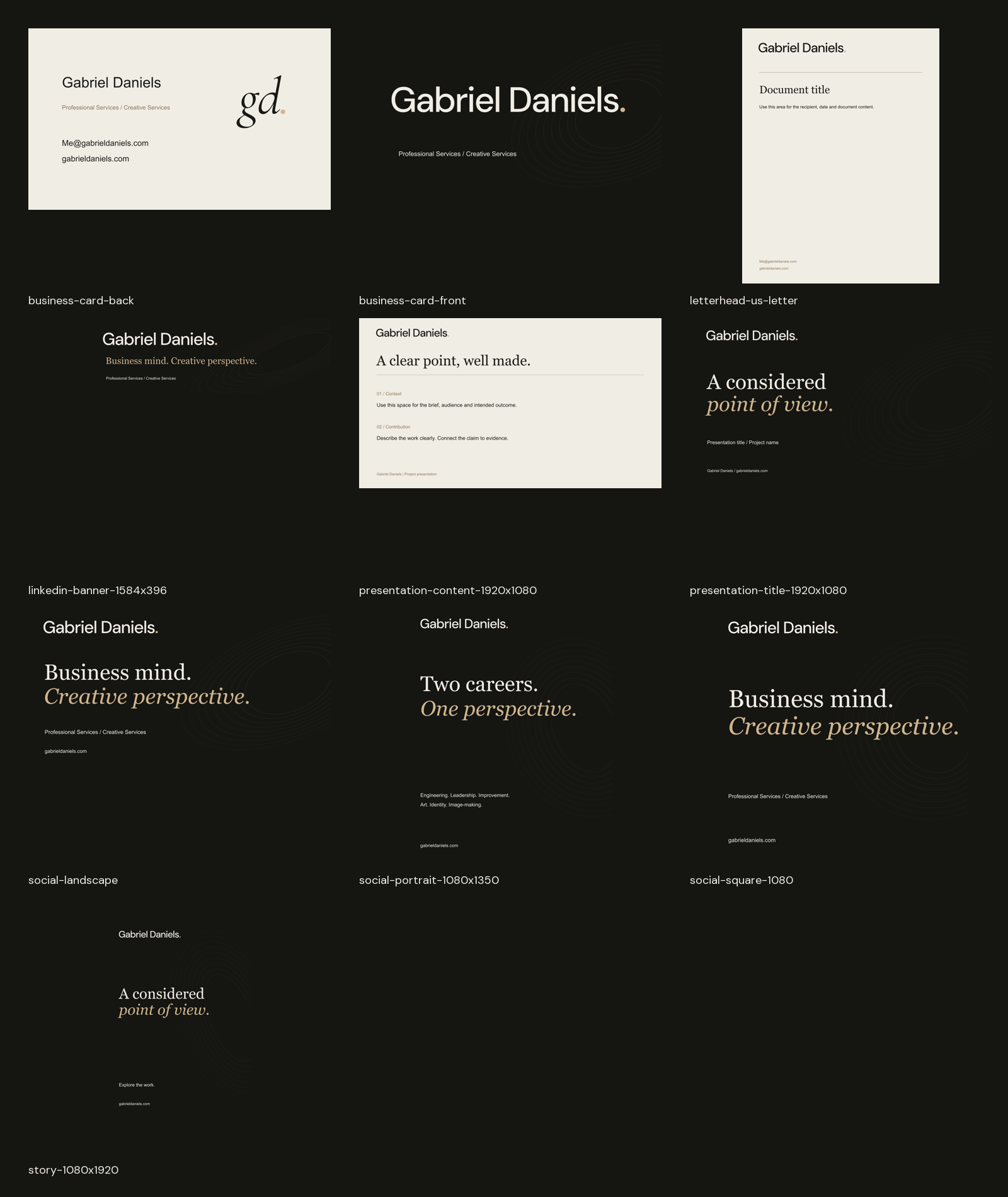
- Application templates sheetPNG · 372 KB
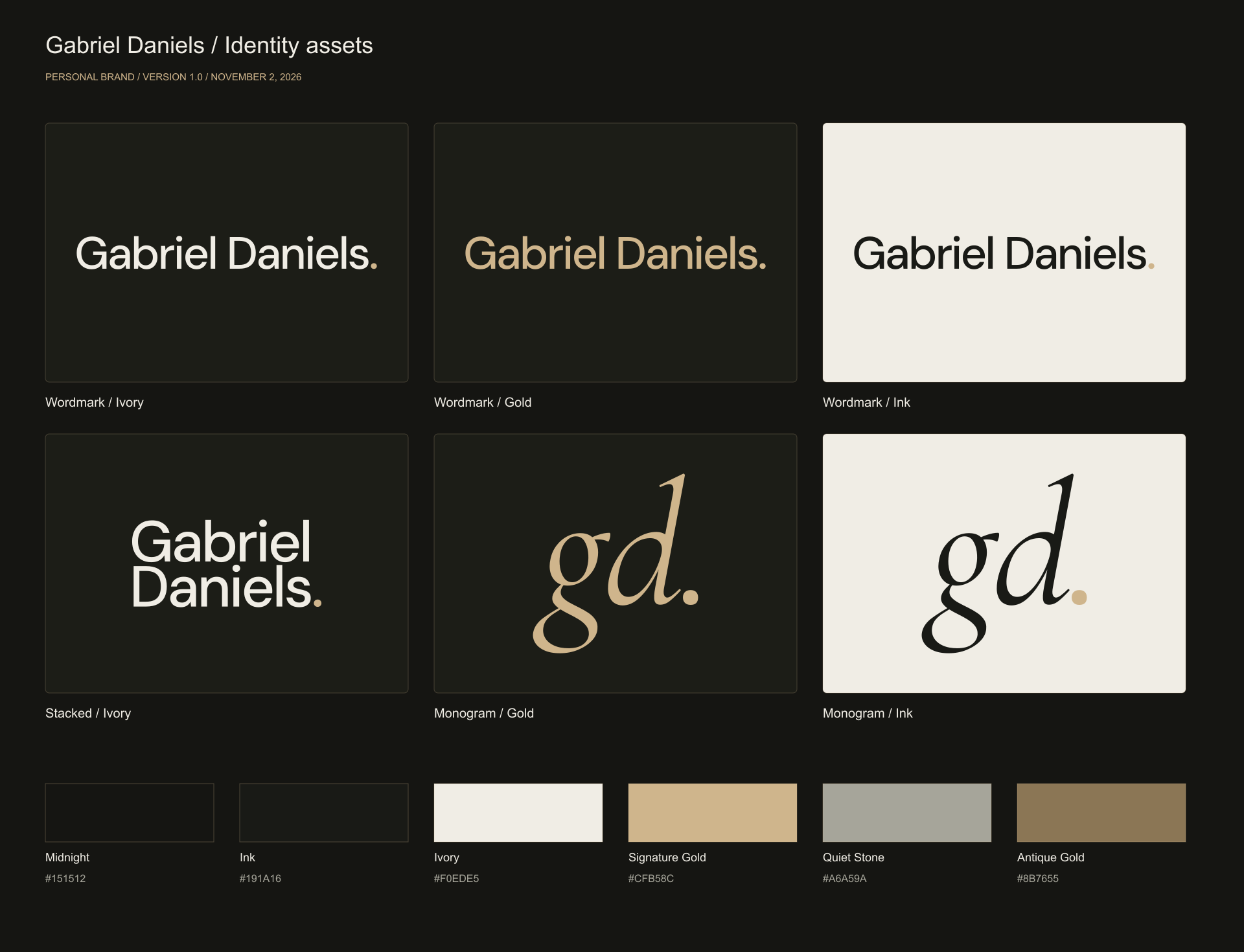
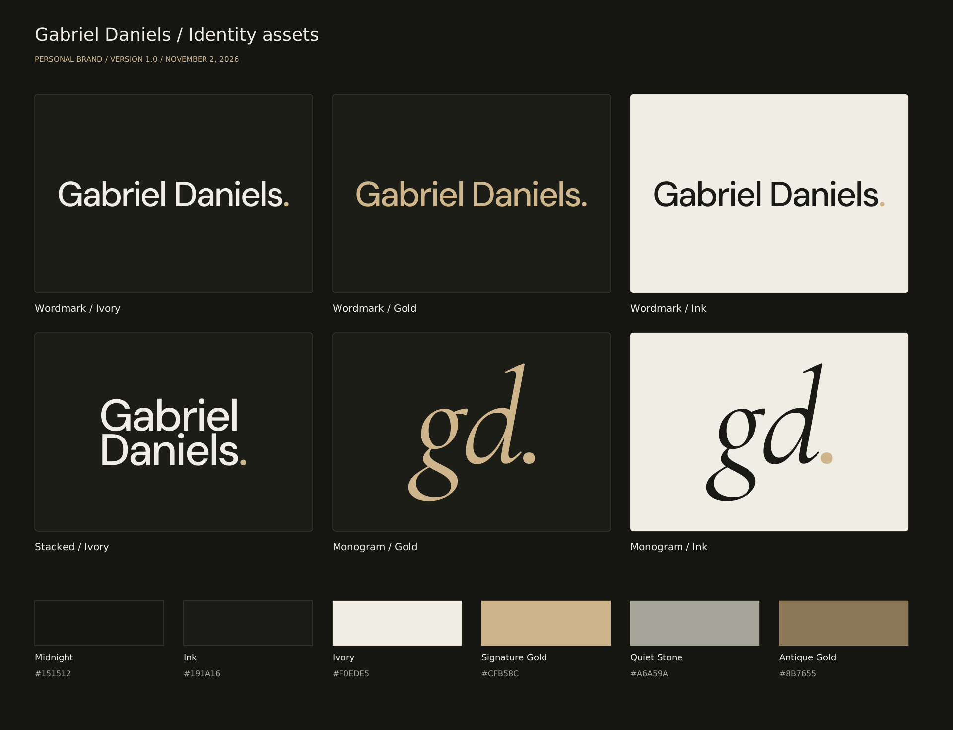
- Identity system overview / PNG 1920pxPNG · 167 KB
- Identity system overview SVGSVG · 32 KB


















Color palettes & design tokens7 files +
Guide & ready-to-use copy3 files +
Typography & font licenses7 files +
Raster logos & icons18 files +
- Monogram / Gold / PNG 2000pxPNG · 101 KB
- Monogram / Gradient / PNG 2000pxPNG · 184 KB
- Monogram / Ink / PNG 2000pxPNG · 98 KB
- Monogram / Ivory / PNG 2000pxPNG · 101 KB
- Monogram / Mono-Ink / PNG 2000pxPNG · 97 KB
- Monogram / Mono-Ivory / PNG 2000pxPNG · 100 KB
- Stacked / Gold / PNG 2000pxPNG · 93 KB
- Stacked / Gradient / PNG 2000pxPNG · 370 KB
- Stacked / Ink / PNG 2000pxPNG · 91 KB
- Stacked / Ivory / PNG 2000pxPNG · 93 KB
- Stacked / Mono-Ink / PNG 2000pxPNG · 90 KB
- Stacked / Mono-Ivory / PNG 2000pxPNG · 92 KB
- Wordmark / Gold / PNG 3000pxPNG · 67 KB
- Wordmark / Gradient / PNG 3000pxPNG · 242 KB
- Wordmark / Ink / PNG 3000pxPNG · 66 KB
- Wordmark / Ivory / PNG 3000pxPNG · 67 KB
- Wordmark / Mono-Ink / PNG 3000pxPNG · 65 KB
- Wordmark / Mono-Ivory / PNG 3000pxPNG · 66 KB













Vector logos18 files +
- Monogram / Gold SVGSVG · 3 KB
- Monogram / Gradient SVGSVG · 3 KB
- Monogram / Ink SVGSVG · 3 KB
- Monogram / Ivory SVGSVG · 3 KB
- Monogram / Mono-Ink SVGSVG · 3 KB
- Monogram / Mono-Ivory SVGSVG · 3 KB
- Stacked / Gold SVGSVG · 6 KB
- Stacked / Gradient SVGSVG · 6 KB
- Stacked / Ink SVGSVG · 6 KB
- Stacked / Ivory SVGSVG · 6 KB
- Stacked / Mono-Ink SVGSVG · 6 KB
- Stacked / Mono-Ivory SVGSVG · 6 KB
- Wordmark / Gold SVGSVG · 6 KB
- Wordmark / Gradient SVGSVG · 6 KB
- Wordmark / Ink SVGSVG · 6 KB
- Wordmark / Ivory SVGSVG · 6 KB
- Wordmark / Mono-Ink SVGSVG · 6 KB
- Wordmark / Mono-Ivory SVGSVG · 6 KB










Editable templates & exports21 files +
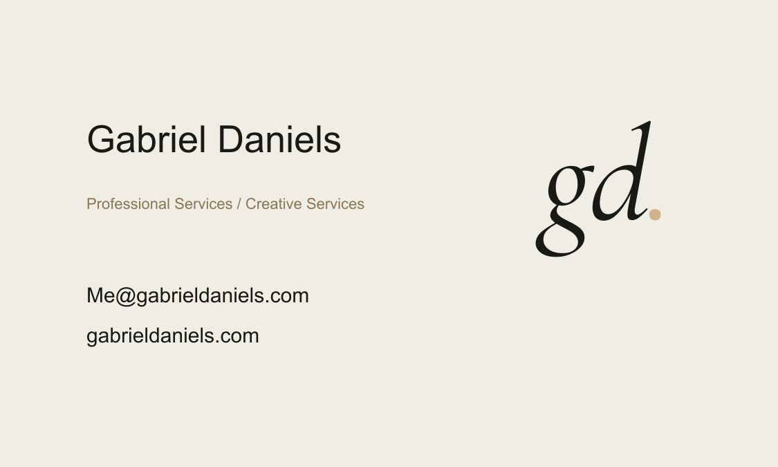
- Business card / Back / PNG 1125pxPNG · 49 KB
- Business card / BackSVG · 3 KB
- Business card / Front / PNG 1125pxPNG · 77 KB
- Business card / FrontSVG · 8 KB
- Email signature / HTMLHTML · 1 KB
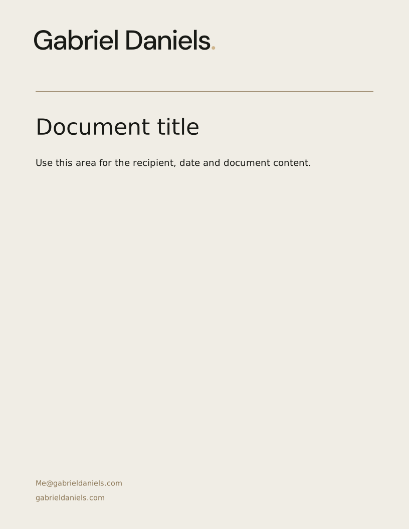
- Letterhead / US Letter / PNG 2550pxPNG · 246 KB
- Letterhead / US LetterSVG · 7 KB
- Profile banner / 1584 x 396 / PNG 1584pxPNG · 84 KB
- Profile banner / 1584 x 396SVG · 8 KB
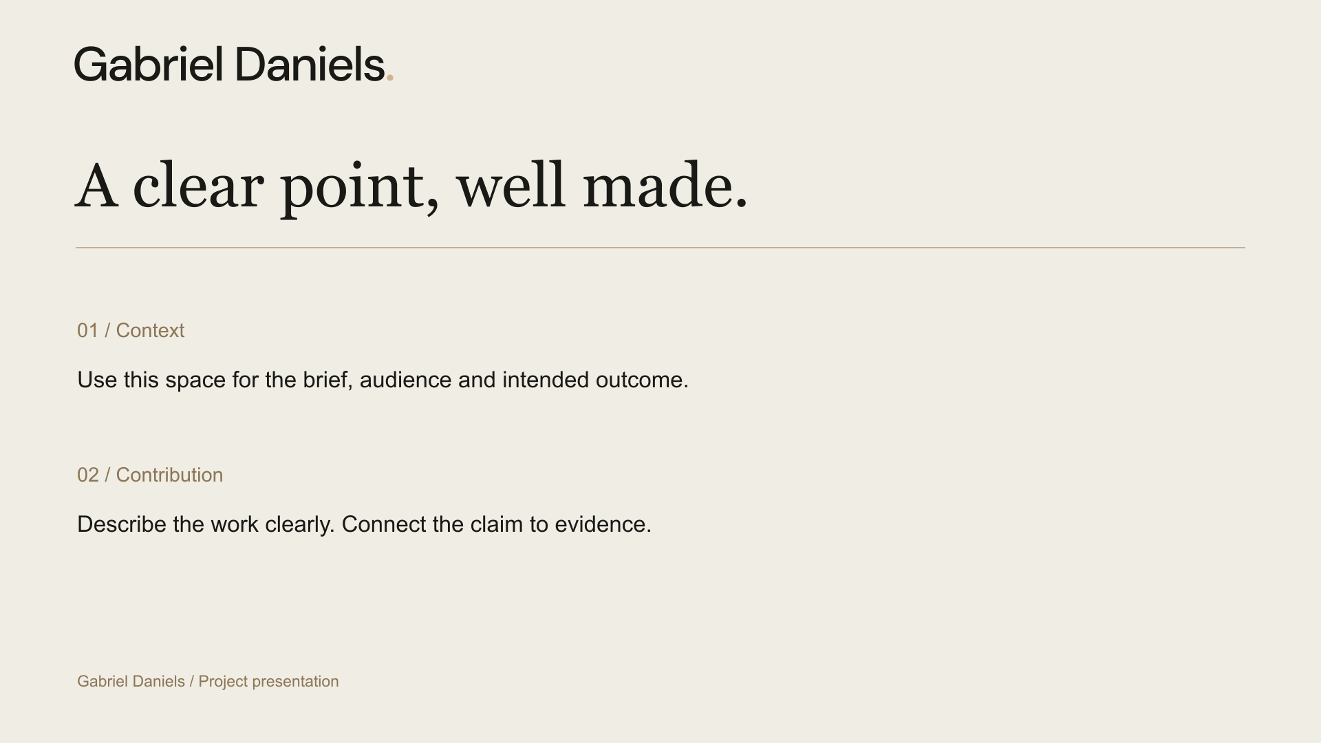
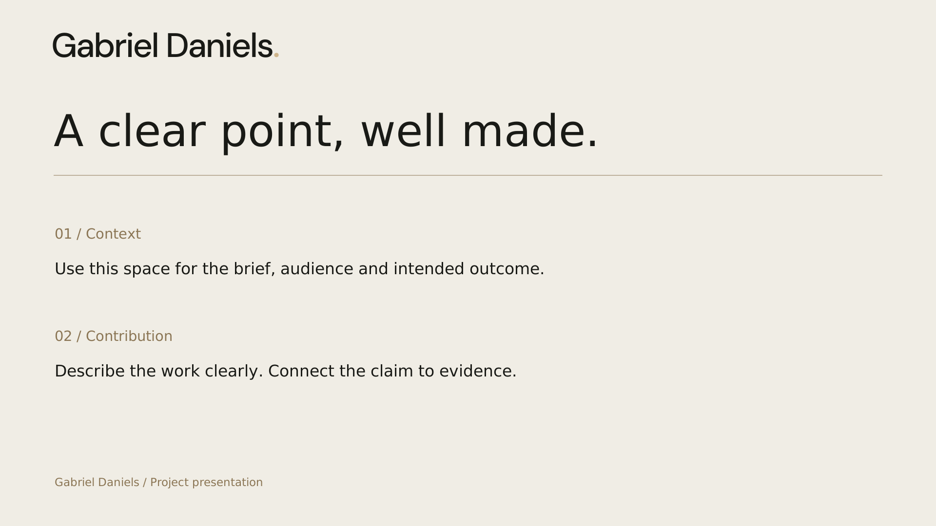
- Presentation content / 1920 x 1080 / PNG 1920pxPNG · 104 KB
- Presentation content / 1920 x 1080SVG · 7 KB
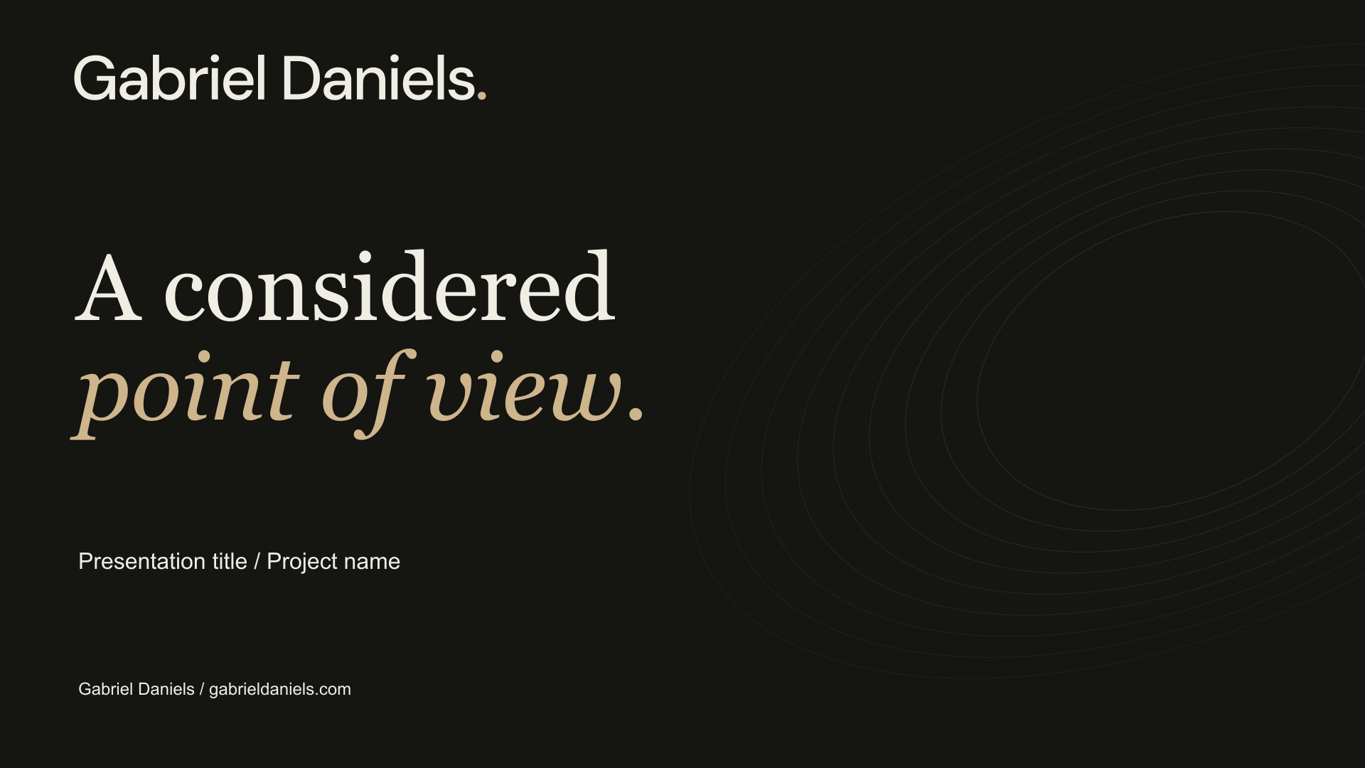
- Presentation title / 1920 x 1080 / PNG 1920pxPNG · 170 KB
- Presentation title / 1920 x 1080SVG · 8 KB
- Social landscape / 1200 x 630 / PNG 1200pxPNG · 98 KB
- Social landscape / 1200 x 630SVG · 8 KB
- Social portrait / 1080 x 1350 / PNG 1080pxPNG · 135 KB
- Social portrait / 1080 x 1350SVG · 8 KB
- Social square / 1080 x 1080 / PNG 1080pxPNG · 119 KB
- Social square / 1080 x 1080SVG · 8 KB
- Story / 1080 x 1920 / PNG 1080pxPNG · 157 KB
- Story / 1080 x 1920SVG · 8 KB


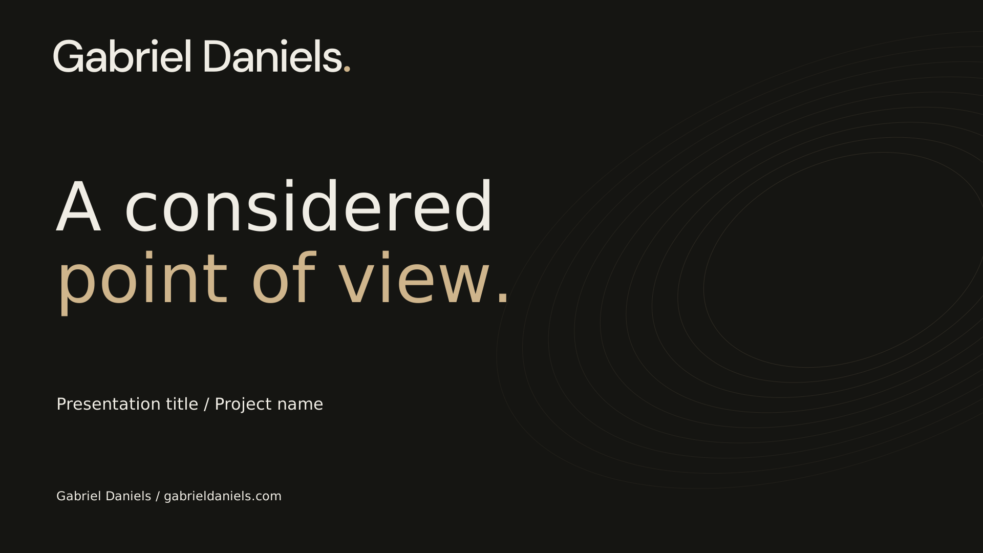
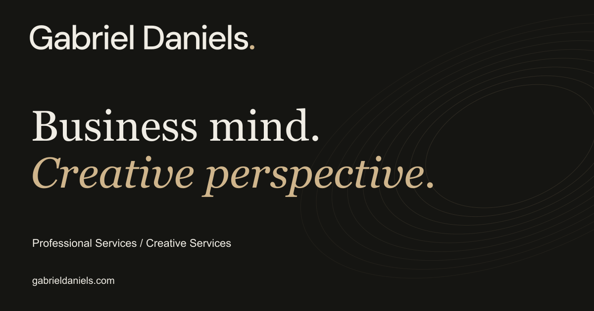
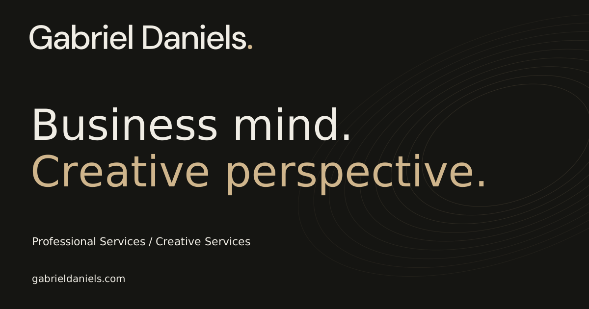
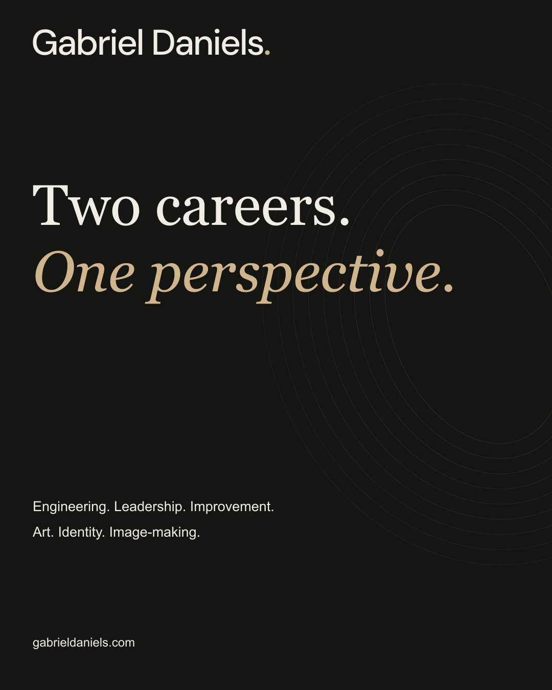
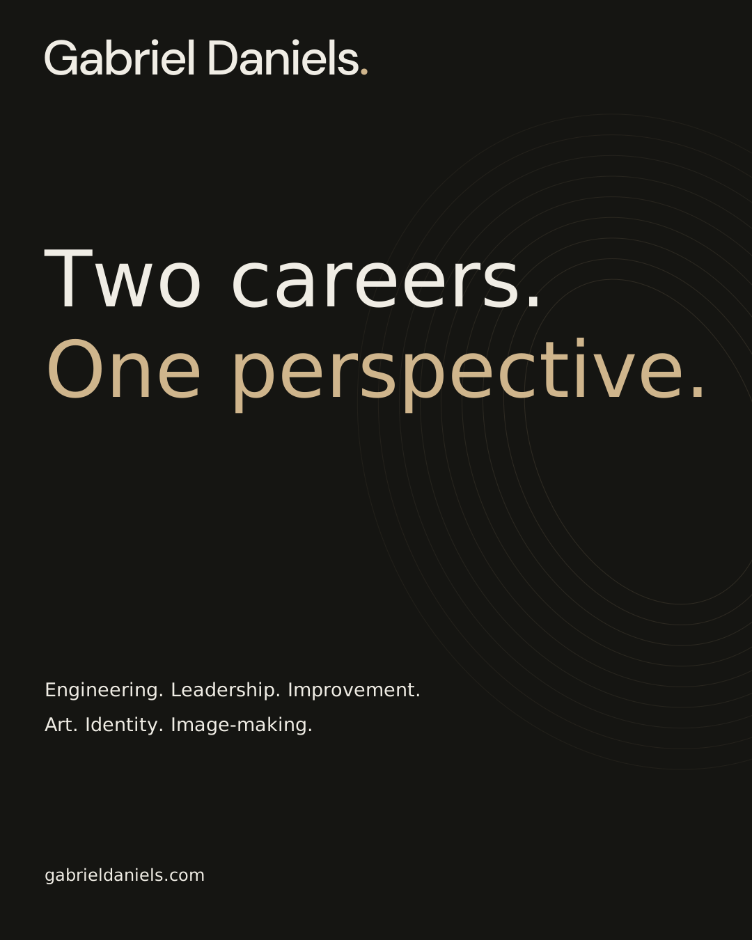
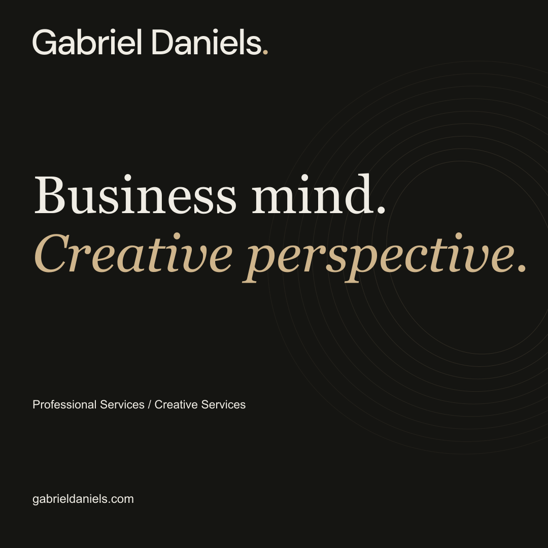
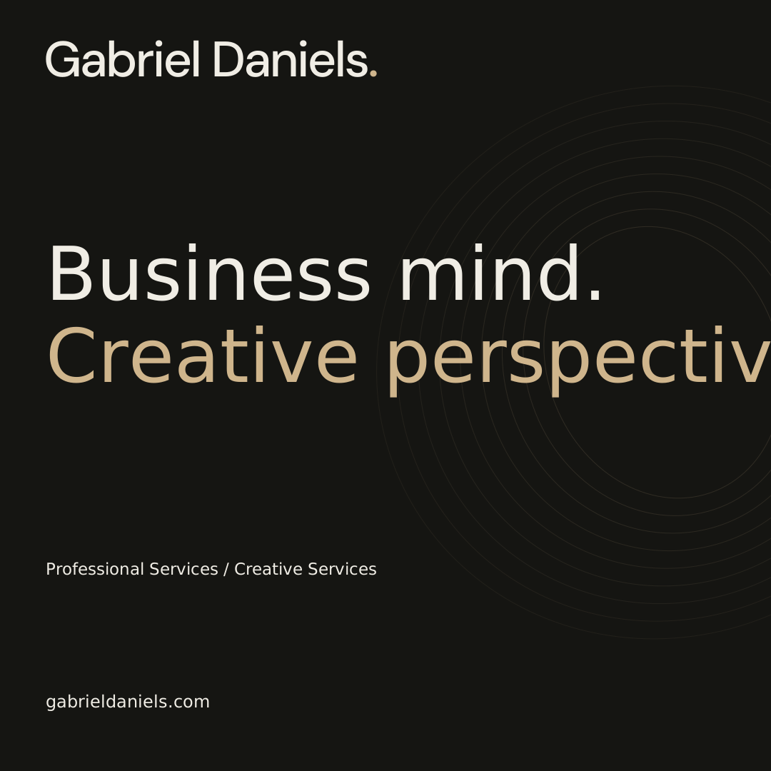
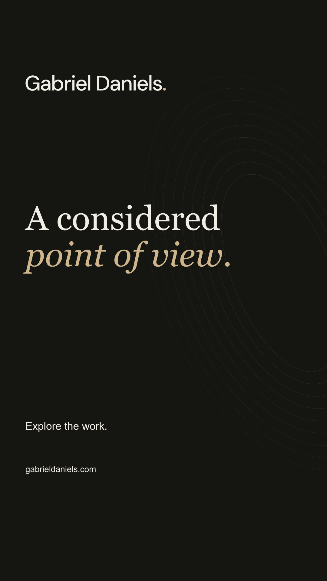
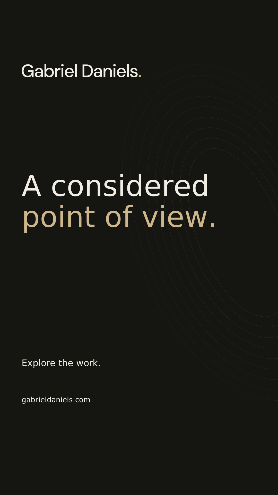
Use the complete kit for a handoff, or choose individual files for a specific task. Client photography, client logos, company logos and third-party site code are not included in the personal-brand package. The package includes font licenses and an asset inventory. SVG masters use outlined lettering; live text remains editable in the supplied templates.
Every detail.
In one place.
This first edition documents the personal identity used on GabrielDaniels.com and extends it into a practical set of reusable assets. Use it to introduce Gabriel, commission work, prepare communications and reproduce the identity consistently. The personal brand connects two practices: Professional Services and Creative Services. Supporting templates and portable logo masters are kit applications of that language; they do not replace the homepage design or the separate identities of DOC N.I.L. and its companies.
A disciplined mind. An artist’s perspective.
The identity makes room for Gabriel’s professional experience and creative practice with equal clarity. Its purpose is to help people understand the work, see the evidence and find the right next conversation.
Purpose
Present Gabriel Daniels as a person whose work connects industrial engineering, production management, continuous improvement and artistic expression. The brand should turn breadth into a useful choice, rather than a long list of unrelated capabilities. A visitor should understand both practices without having to know the company structure first.
Positioning
A personal practice with an engineer’s discipline and an artist’s perspective. The professional offer brings structure to operations and business challenges; the creative offer turns direction into identity, websites, photography, film and finished visual work. This is positioning language for the kit, not a quotation attributed to Gabriel.
Value proposition
Start with the problem, connect the right disciplines, and make the contribution visible. Show what Gabriel did, who it served and what the evidence supports. Specific project context carries more weight than broad claims about being premium, innovative or the best.
What should remain memorable
- Two careers are visible and equally credible.
- The presentation feels considered, tactile and cinematic.
- Case studies distinguish the client, the assignment and Gabriel’s contribution.
- The path from discovery to the relevant specialist is direct.
Make the right person feel understood.
The same identity serves different needs. Adjust the opening message and evidence to the audience while keeping the name, visual system and factual standards consistent.
Professional audiences
Speak to operations leaders, manufacturers, logistics teams and business owners who need help with production performance, process improvement, leadership or business structure. Lead with the assignment, operational context and recorded result. Use precise terminology where it helps a decision; explain abbreviations on first use.
Creative audiences
Speak to founders, brands, talent and teams that need a clear identity or strong visual communication. Lead with the brief, the audience and the work itself. Distinguish strategy from production and distinguish the services delivered from services that are simply available.
Collaborators and media
Provide the correct biography, full name, contact route and portable marks. Supply a defined file set rather than asking a partner to pull images from the website. An introduction should identify Gabriel’s role before listing associated businesses.
Desired journey
- Understand Gabriel and choose Professional Services or Creative Services.
- Open a relevant portfolio or case study.
- See scope, contribution, attribution and evidence.
- Visit the matching specialist company or start a conversation.
Quiet confidence. Visible substance.
The personality is thoughtful, curious and assured. Luxury comes from restraint, proportion and craft, with enough play to make the experience human.
Disciplined
Use clear hierarchy, deliberate spacing, consistent alignment and accurate language. Data, service labels and links should feel reliable. Every interaction needs an understandable purpose.
Imaginative
Use scale, perspective, photographic composition and movement to reveal the work. Expressiveness belongs in the presentation; it must not blur a factual claim, obscure a label or hide a route.
Human
Write as a person speaking to a person. Explain the problem and the contribution in plain language. Show personality through real images and specific choices, rather than invented quotations or generic motivational statements.
Considered
Let one thing lead at a time. A strong image, an editorial line or a useful metric should have room to work. Gold is an accent and light is an atmosphere; neither should become visual noise.
Decision test
- Does this help someone understand the person or the work?
- Can the reader tell which practice and which company are involved?
- Is the claim supported, and is the next action clear?
- Does the experience still work without motion?
One personal identity. Distinct businesses.
Gabriel Daniels is the personal name and the organizing point for his professional and creative histories. DOC N.I.L. is the parent company connecting the operating companies; it is not another spelling of the personal identity.
The two service paths
Use Professional Services for consulting, engineering and operational leadership, process improvement, management and related business support. Use Creative Services for making identities, websites, photographs, film and other creative work. A project can use several disciplines, but its case study should have one clear primary category and name the supporting services.
The company system
DN Websites owns the website strategy, design, development and launch destination. DN Creative connects brand strategy, identity and ongoing brand support. DN Media is the advertising and campaign destination. DN Production connects video, film and post-production. DNWide connects fitness model representation, development, casting and creator content. Use the current company destinations supplied in this guide.
Names and historical credits
Write DNWide with this capitalization. Use DOC N.I.L. as the formal parent label. DN Creative was formerly Opulence Solutions; DN Production was formerly Opulence Images; DNWide was formerly Fit and Talented. Use former names to explain an archive credit, rather than as current navigation labels. The logo and identity studio is a specialist destination, not a sixth operating company.
Client work stays client work
Rezenkia Lee and Claire Ofotokun (COFO) are client and talent case-study subjects. Their names, identities, images and outcomes must not be presented as owned Gabriel Daniels brands. A project thumbnail is evidence of work, not a general license to reuse that client’s mark.
Be clear before being clever.
Use direct, specific sentences. The voice should feel candid, capable and interested in the reader’s situation. Keep promotional language close to visible work and verifiable facts.
Writing rules
- Lead with the need, the work or the result.
- Use first person for Gabriel’s perspective and named companies for company capabilities.
- Prefer concrete verbs such as plan, design, improve, photograph, build and deliver.
- Explain what a service includes and what happens next.
- Use sentence case for most headings; reserve spaced capitals for short navigational labels.
Claims and evidence
Describe résumé assignments as consulting projects in line with Gabriel’s stated history. Give the recorded role, context and evidence. When a metric comes from a résumé, label it as résumé-reported. Do not manufacture timelines, promotions, revenue, audience growth, qualifications, testimonials or awards. Keep client outcomes distinct from the capabilities being sold today.
Examples
Prefer “Explore my consulting projects” to “Unlock unlimited operational excellence.” Prefer “Logo design, brand strategy and business consulting for Rezenkia Lee” to “A revolutionary brand transformation.” A useful call to action says where it goes: View the case study, Explore the websites, or Start a conversation.
Names and contact
Use Gabriel Daniels in full on first mention. Use Claire Ofotokun (COFO) on first reference to that case study; do not change it to Coco. Preserve client-preferred naming and terminology. Public inquiries go to Me@gabrieldaniels.com.
Introduce the person behind the work.
Use these factual introductions as starting copy. Choose the length that fits the setting, preserve the two-practice distinction and update details when Gabriel confirms a change.
Short bio
Gabriel Daniels is an industrial engineer, production manager, Lean Six Sigma Black Belt and artist. His work connects professional consulting with creative direction, brand identity, websites, photography, film and high-end retouching.
Long bio
Gabriel Daniels brings an engineer’s discipline and an artist’s perspective to his work. His professional practice spans industrial engineering, production management and continuous improvement across manufacturing and logistics. Consulting projects connect plant operations, manufacturing performance, team leadership and Lean Six Sigma practice. His educational foundation includes a bachelor’s degree in Industrial Engineering and a Master of Business Administration, alongside his Lean Six Sigma Black Belt credential. His creative practice brings together art, logo design, brand identity, websites, photography, film, creative direction and high-end retouching. On GabrielDaniels.com, Professional Services and Creative Services organize the work into two clear paths. Portfolios show the finished work; case studies explain the brief, his contribution and the supporting evidence. His ventures have their own company identities within the DOC N.I.L. group.
One-line introduction
Gabriel Daniels — industrial engineering, operational leadership and creative practice.
Usage
Use the short bio for credits, event introductions and social profiles. Use the long bio for a press request, proposal or partner introduction. Do not add unverified institution names, dates, honors, client endorsements or claims of licensure.
Use the right mark for the space.
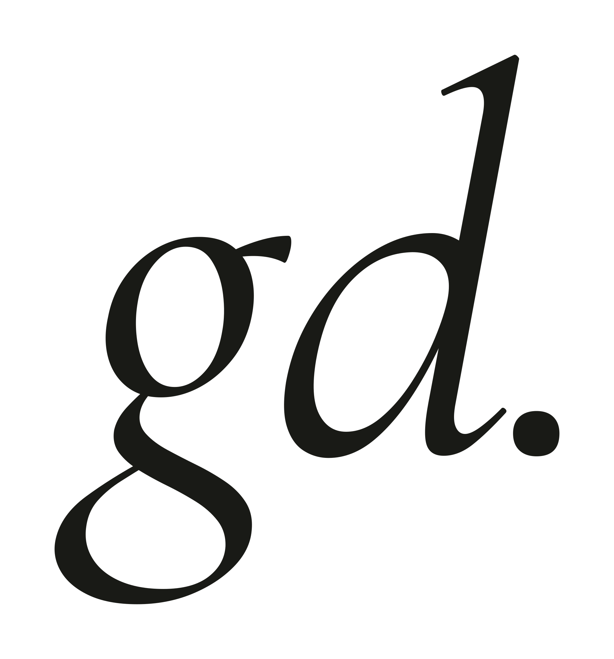
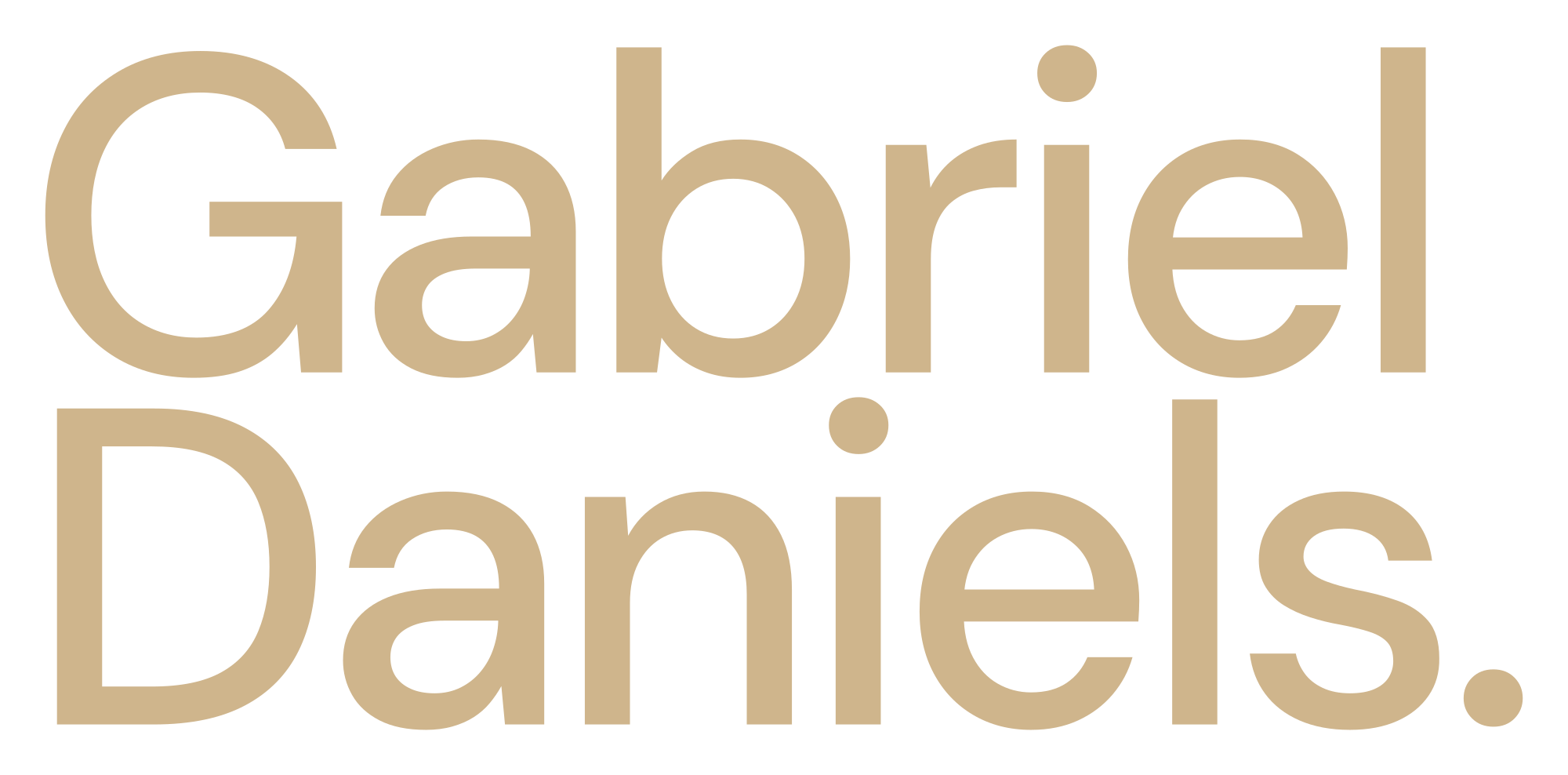
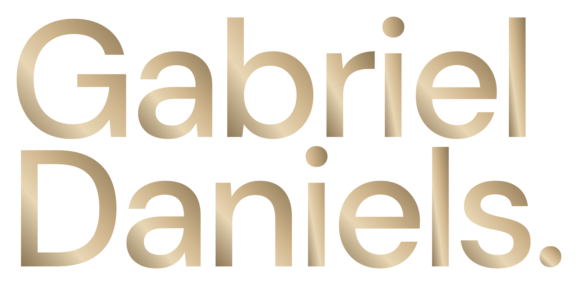
The full-name wordmark is the primary identifier. The gd. monogram is a supporting signature for compact applications. Downloaded portable masters reproduce the visual language in fixed, shareable files; the live site keeps its existing native interface typography.
Primary and secondary marks
Use Gabriel Daniels. as the first-choice horizontal wordmark. The final period is part of the identifier and may carry Signature Gold. Use the stacked full name when a narrow format requires it. Use the lowercase italic gd. monogram only when the full name is nearby, already established, or available in an accessible label. The square icon is for avatars and small digital spaces.
Clear space
Define x as the cap height of the G in the full-name wordmark. Keep at least 1x of clear space around each side of the visible mark. For the monogram and icon, use one-quarter of the visible mark height as the minimum safety zone. Increase space next to photography, partner marks or dense text.
Minimum reproduction
As kit production guidance, use the horizontal wordmark at least 160 CSS pixels wide on screen or 35 mm in print. Use the stacked name at least 100 pixels or 25 mm wide. Use the monogram at least 32 pixels or 10 mm. The simplified square icon may appear at 16 pixels only after a visual check. These are minimums, not preferred sizes.
Variants and misuse
- Use Ink on Ivory, Ivory on Midnight, or a single-color master when the process requires it.
- Use the gold treatment on a dark, quiet field; use the gradient only for screen display.
- Never stretch, shear, redraw, outline, rotate or add an unprovided shadow to the mark.
- Do not remove the period from the wordmark, alter the letter spacing, or swap the typeface in the master artwork.
- Do not place the mark over a face, a busy image or a similarly valued background.
Black, gold and ivory. In balance.
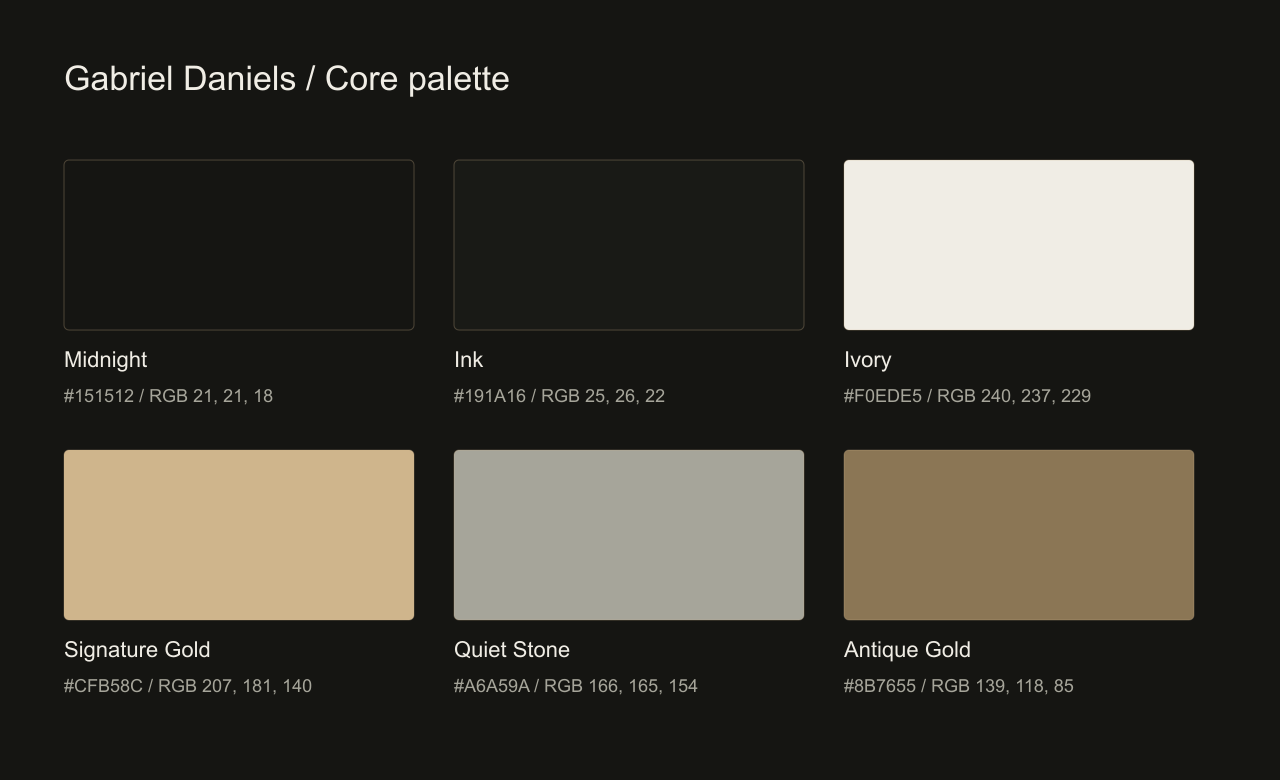
Midnight and Ivory establish the contrast. Ink carries the reading. Signature Gold supplies focus, while Antique Gold and Quiet Stone support the editorial rhythm. Use the exact digital values in the supplied token files.
Palette hierarchy
Build most compositions from one dominant neutral field and one reading color. Use Signature Gold for a key rule, a selected state, a small highlight or a short display phrase. Quiet Stone is secondary copy on dark backgrounds. Antique Gold belongs to light-surface emphasis and decoration, with contrast checked at the final size.
Practical proportion
A useful starting composition is about 80% neutral field, 15% contrasting content and 5% gold emphasis. This is an art-direction guide, not a quota. Photography can carry its natural color; it does not need to be tinted gold to belong to the system.
Contrast and legibility
Use Ivory on Midnight and Ink on Ivory for normal reading. Signature Gold and Quiet Stone are also suitable for normal text on Midnight. Signature Gold on Ivory is decorative and fails normal-text contrast. Antique Gold on Ivory is reserved for large text or decoration; use Ink for small labels and paragraphs. Read the computed contrast table in this guide before choosing a pair.
Print translation
Digital HEX and RGB values are the screen reference. Any supplied CMYK conversion is a provisional process starting point, not an exact brand match or a spot-color specification. Paper, ink, profile and finish change the result. Approve a physical proof before production; request a separate supplier proof for foil, metallic ink or unusual stock.
Editorial expression. Functional clarity.
Cormorant Garamond gives the identity its expressive display voice. The website’s functional layer uses the visitor’s native system sans. DM Sans is the portable companion for exported artwork and kit templates.
Display
Use Cormorant Garamond Regular for generous titles and Italic for a purposeful emphasis or a second line. Start digital display sizes around 64–112 pixels on larger screens and 44–64 pixels on phones, then adjust to the real words. Keep tight leading for large titles and enough width to prevent awkward fragments. Do not set every heading in italics.
Reading and interface
Use the native system stack for web body copy, controls, navigation and data. A useful reading range is 16–18 pixels with 1.5–1.8 line height and 45–75 characters per line. Labels may be smaller when nonessential, but must remain readable and pass contrast. Buttons and form fields need clear labels, even when the visual treatment is minimal.
Portable files
Use DM Sans for editable documents and templates when native system fonts would vary across machines. Portable logo SVGs use fixed artwork so the mark does not depend on an installed font. Editable templates may still need the named fonts; keep their license files with any included font binaries.
Hierarchy
Use no more than three strong type levels in a single view: a title, supporting explanation and functional action. Let whitespace create separation before adding weight, boxes or extra type styles. Use tabular numerals for comparable data.
Give the work room to breathe.
The system uses generous margins, clear chapter boundaries and controlled contrast. A layout should feel composed on a wide display and remain direct on a small screen.
Grid and spacing
Use a 12-column composition for complex desktop layouts and a simple single column for narrow screens. Start with a 4-pixel spacing unit; common steps are 8, 12, 16, 24, 32, 48, 64 and 96 pixels. Keep related elements close and separate different ideas with larger steps. Let the website’s fluid gutter scale rather than hard-coding one desktop margin everywhere.
Cards and lines
Use thin, low-opacity gold rules to organize content. Large editorial areas can stay unboxed. Photography cards should preserve the subject and their intended crop; contain transparent cutouts so fine edges and spray remain visible. Keep shadows soft, with a plausible light direction. Avoid repeated thick borders, excessive nested panels and competing rounded shapes.
Gold glass controls
Buttons may combine a subtle transparent gradient, a fine light edge, restrained blur and a soft highlight. Text needs a stable dark or light reading surface beneath the glass. A solid fallback is required when blur is unsupported. Distinguish default, hover, focus, pressed and disabled states. Keep the primary action visually stronger than supporting links.
Interaction dimensions
Use at least 44 by 44 CSS pixels for important touch controls, with room between adjacent targets. Keep focus rings visible. Do not communicate a selected state through gold alone; use text, shape, an underline or an accessible state as well.
The work is the evidence.
Photography and portfolio imagery bring the identity to life. Natural expression, considered cropping and clear attribution should lead; decorative effects support the image rather than replace it.
Selection
Choose images that show a distinct skill, a meaningful moment or a real project application. Pair a wide frame with a detail only when each adds information. Alternate photography, websites and brand work deliberately. The personal portrait belongs to Gabriel’s introduction; client imagery belongs to its project context.
Treatment
Preserve skin tone, material detail, facial identity and the intent of the original image. Background removal can support a floating composition, but keep fine hair, transparent liquid and the full subject where possible. Label a cutout or creative treatment when it matters to understanding the work. Never present a composite as proof of an event or a client outcome.
Cropping and captions
Protect eyes, hands, products and important environmental context. Check every responsive crop. Use descriptive alt text that identifies the content and purpose, not a list of search keywords. Captions should explain the assignment or the image, and name the client or talent correctly. Separate a photograph’s credit from the current company’s service connection.
Rights
A portfolio appearance does not grant a partner permission to download and republish a client image. Ask for the agreed image set, use, duration, territory and credit. Do not include client logos, model images or restricted project files in the general personal-brand download.
Reveal the story as people move.
The motion language is scroll-led, cinematic and optional. It should help someone understand a chapter, notice a project or enjoy a moment of play while keeping the content usable.
Choreography
Use one leading movement at a time: a measured image transition, a perspective change, a line drawing or a controlled reveal. Let foreground and background move at different restrained rates to create depth. Keep text stable long enough to read. Use easing that settles naturally rather than repeatedly bouncing. Website source uses cubic-bezier(.19,1,.22,1) as a signature settling curve.
Timing
For supporting interactions, start around 150–250 ms; for content reveals, 600–1,000 ms. Scroll-driven scenes should follow actual progress instead of forcing a long wait. These are supporting-kit guidance ranges. Preserve the purpose of the existing scene rather than adding animation just to increase activity.
Access and performance
Honor reduced-motion preferences and the visible motion control. With motion off, expose the same information and links in a readable static layout. Keyboard and touch users must be able to reach every meaningful action. Avoid flashing, scroll traps and interactions that require a fine pointer. Pause offscreen activity and keep large assets from blocking the first useful view.
Play with boundaries
Doc, particles and games are optional expressions of curiosity. They must not be the only route to work, contact or downloads. Keep controls clear of fixed navigation and phone safe areas. Do not export the character’s artwork or third-party code as a reusable logo asset.
A practical system beyond the website.
Templates provide a starting composition, not a substitute for a clear brief. Use the supplied logo masters, maintain the palette hierarchy and adapt the content to its audience.
Social and partner media
Use the full-name mark or an established monogram inside the platform’s safe area. Keep essential text away from crop zones. A social card should communicate one subject, with a short title and a clear destination. Recheck platform crops at export; do not assume one image size fits every placement.
Presentations and proposals
Open with the full name, a useful project title and the relevant practice. Use Ivory pages for detailed reading and Midnight covers or chapter dividers for emphasis. Make charts legible and name the source of each result. Show client work only in the context and scope authorized for that presentation.
Business card and stationery
Keep the full name, website and public email prominent. Leave space for the recipient to read the details without rotating or searching. Add a phone number or address only after confirming it is intended for public use. When printing, confirm final size, safe area and bleed with the printer rather than scaling a screen export.
Email signature
Use live, selectable contact text with a simple name and two useful links. The signature should remain understandable when images are blocked. Keep promotional banners, multiple badges, oversized logos and dense legal text out of the default signature. Test a sent message in light and dark modes before a broad rollout.
Pick the file that fits the job.
The kit separates final masters, practical exports and editable templates. Keep the original files intact and create project-specific copies for adaptation.
SVG and PNG
Use SVG for sharp scaling on websites, in compatible presentation software and in vector workflows. Outlined logo SVGs preserve the shape without requiring the font to be installed. Use transparent PNG for applications that do not handle SVG. Choose an export at least twice its displayed pixel size when practical; never enlarge a small icon into a large print mark.
Color and transparency
Use transparent artwork over the selected brand surface, and check the edge against both dark and light backgrounds. A white checkerboard should never be baked into a final asset. The screen gradient is a digital treatment; use a one-color master for embossing, engraving, embroidery or a single-ink process.
File naming and versioning
Keep the descriptive name, mark, color, format and version in the file name. Share the current archive and guide together. Do not call a renamed old file a new master. If a printer requires a different format or a special production specification, make a clearly labeled derivative and preserve the source.
Before release
- Check the file opens and has no missing fonts or linked images.
- Inspect the mark at the actual intended size.
- Confirm the correct color variant and sufficient contrast.
- Check contact links, spelling, accessible text and client credits.
- Inspect a print proof or device preview before committing to the run.
Make reuse clear and responsible.
The downloadable package is intended for accurate representation of Gabriel Daniels and authorized brand-related work. Access to a download does not transfer ownership of the identity or grant an endorsement.
Personal identity assets
Use the supplied marks to identify Gabriel Daniels in agreed introductions, collaborations, presentations and media coverage. Keep the mark intact, preserve the naming and avoid suggesting a partnership, sponsorship or certification that has not been agreed. Contact Gabriel for uses beyond accurate identification or commissioned brand work.
Fonts and components
Open-license fonts retain their own license conditions and notices. A font license is separate from rights in the Gabriel Daniels identity. Keep supplied notices with redistributed font files. Native operating-system fonts are not distributed in this package. Code tokens and templates support the identity; third-party libraries and the interactive site source are not automatically included.
Clients and companies
DOC N.I.L. and its operating companies retain their distinct identities. Their marks are not interchangeable with Gabriel’s personal mark. Client and talent materials, including Rezenkia Lee and Claire Ofotokun, are excluded from the general brand asset license. Request permission and the correct project files for those uses.
Attribution and corrections
Preserve project credits where supplied. Explain an archived company name only when the historical credit requires it. Report a wrong name, obsolete destination or unsupported claim before publishing it again. Use Me@gabrieldaniels.com as the central contact for permission and corrections.
Keep one source of truth.
Treat this guide and the matching download archive as a versioned pair. A consistent identity depends on small, accurate decisions being carried through every output.
Designer handoff
Start with the current guide, final vector masters, raster exports, color tokens and editable templates. Confirm the audience, practice, intended use and deliverables. Agree the approval route before creating a campaign or a new identity application. A template is ready to customize; it is not approval of the final message or a new company offer.
Review checklist
- Identity: correct name, mark, clear space, size and variant.
- Content: correct Professional or Creative category, factual role and supported result.
- Architecture: personal, company and client identities remain distinct.
- Visuals: coherent palette, type hierarchy and intentional image crops.
- Access: readable contrast, live text, descriptive links, keyboard access and motion alternatives.
- Delivery: working downloads, correct files, useful names and preserved notices.
Updating the system
Record the version, date and reason when a logo master, contact detail, company destination or rule changes. Update the online guide, PDF and archive together. Retire superseded files from the public download rather than leaving competing editions visible. Project images and case-study evidence should retain their own source and attribution records.
Contact
For the current files, permissions or a new project, visit GabrielDaniels.com or write to Me@gabrieldaniels.com. The website remains the public starting point for Gabriel’s professional experience, creative portfolios, case studies and specialist company destinations.
Readable by design.
| Pairing | Ratio | Use |
|---|---|---|
| Ivory on Midnight | 15.64:1 | Normal & large text |
| Ink on Ivory | 14.95:1 | Normal & large text |
| Signature Gold on Midnight | 9.27:1 | Normal & large text |
| Quiet Stone on Midnight | 7.38:1 | Normal & large text |
| Antique Gold on Ivory | 3.72:1 | Large text only |
| Signature Gold on Ivory | 1.69:1 | Decoration only |